
This project was based on a speculative creative brief in DesignLab’s UX Academy curriculum. I completed the project over a 2-week duration. I carried out the role of a Product Researcher, Designer, and Copywriter. Stakeholders are mentors and industry professionals.
The Water Street Tampa (WST) area is rapidly changing, adding a variety of hidden gems and connecting to nearby areas in various ways. The diverse, vibrant and easily accessible options WST has to offer are not well organized for tourists seeking a local experience.
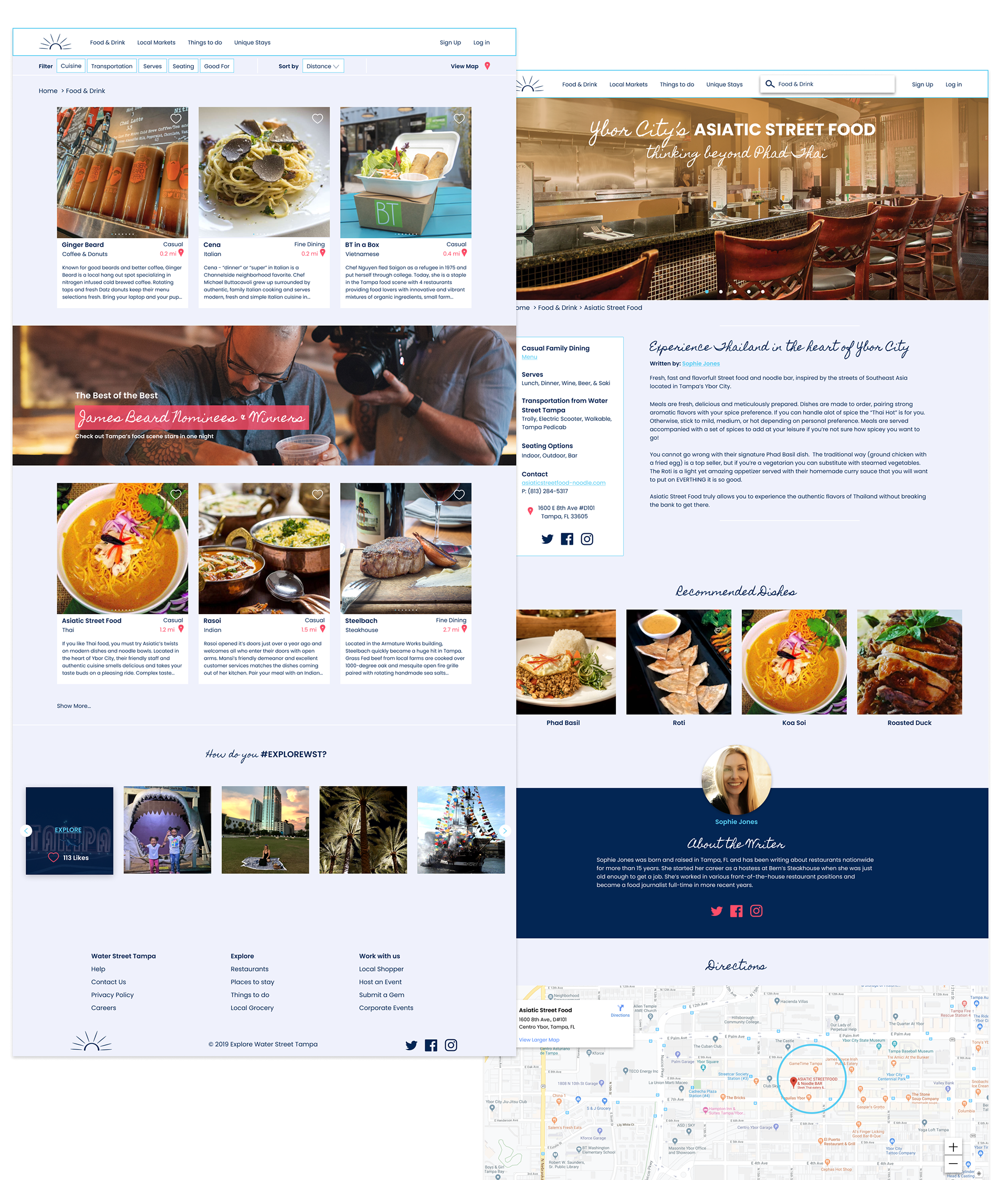
Explore Water Street Tampa is a nonprofit business that curates carefully selected restaurants, local markets, things to do, and unique places to stay. During a professional tech training workshop being held in WST, I received an overwhelming amount of questions from visitors looking to get a local perspective. This experience, created an opportunity to gather information tailored to business professionals visiting or newly relocated to the WST area.
The rapid change is due to the $3 billion, 16-block mega-development renovation WST is under. The development includes a JW Marriott hotel, a $164.7 million University of South Florida Morsani College of Medicine and Heart Institute, various restaurants, parks, activities, office buildings, and retail shops.
Visitors were Missing Out
Professionals in the training workshop were ordering mediocre delivery or taking lengthy Uber rides to far away grocery stores. On the weekends, they were looking for fun and relaxing things to do but weren’t sure where to start. Online reviews were often unreliable. Franchises often appeared in search results near the top of the list. It was difficult to find the hidden gems online.
Solving the Problem
The team at Explore Water Street Tampa spent several months collecting information to launch the site. A board of local experts was selected to secret-shop local businesses and write articles. A scoring guide was developed for each category to ensure the team was thorough. Hundreds of locals were interviewed and video/photo shoots helped capture the enthusiasm.
The goal was to take the content the team meticulously gathered and launch a fully responsive site, keeping the following goals in mind:
· Visitors should not feel influenced by unreliable reviews or bombarded with ads.
· The site should be inviting and engaging. The success of the site’s performance would be measured by time spent on site.
· Visitors should be able to quickly identify location proximity and the various means of transportation to arrive at their desired selection.
· Information should be organized and displayed so users feel like a local immediately.
· Visitors should be able to find what they are looking for and gather enough information to form their own opinion on what they want to explore.
“There are so many ways for visitors who don’t have a car to explore Water Street Tampa. Whether your journey is on the electric scooter path, the Cross Bay Ferry’s schedule, the Downtowner’s zone, near a Trolly stop or a rental bike rack, Explore is an unbiased site that allows business professionals, new residents, and tourists alike to form their own opinions.” — Co-Founder, Explore Water Street Tampa
Handling an Aggressive Timeline
With an aggressive 2 week timeframe to launch the site, time management was extremely important. Before diving into the project, I developed a list of deliverables, tasks, and milestone meetings required to go live.
Throughout the 2 weeks, it was imperative the stakeholders were on the same page in order to launch on time. Explore would be publicly announcing the site at the end of October and wanted a 2 week post launch buffer to work out any kinks. Regularly scheduled meetings would be an important piece to include in the timeline. I wanted to avoid any surprises or roadblocks to the best of my ability.
Conducting Research
Through competitor research, I realized most tourist websites rely heavily on algorithms using ratings and reviews to display options to visitors.
· Would users be looking for reviews and ratings from other people?
·How would Explore build a reputation to make visitors feel confident in their recommendations?
In order to find out, I interviewed several individuals who fit the target demographic. As it turns out, this was not a concern.
"If I’m reading a review on Yelp, I don’t trust it. The people writing the reviews aren’t people I’m looking to learn from. I go to Zagat or James Beard Award. Those are reputable reviewers who I’m looking for recommendations from.” — Male, 49 years old, travels 26 wks/yr on business
Since Explore wanted to convey a high level of trust, I decided to interview local concierges to see what types of questions they received from travelers.
· What did local concierges notice about the travel industry?
· What trends they were seeing?
· How were guests finding things to do and booking their reservations?
·What made a lasting impression on them?
·What did they complain about?
Explore wanted their site to mirror a guest’s experience with an excellent in-person concierge in a digital format.
“Travelers use us [concierges] less and less. People kind of, make their own reservations and depend on Yelp and OpenTable. The ones who do come to us, really trust and rely on us to hit a home run with our recommendations.” — Female, Concierge for 8 + yrs, Tampa
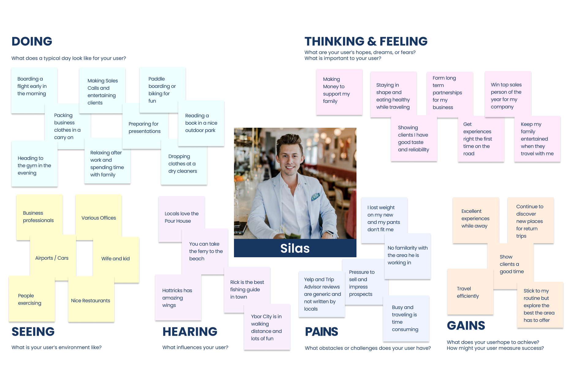
Based on my experience interacting with tourists at the tech training, I was able to develop a persona and empathy map that would guide my unique selling proposition. After taking a group of 16 visiting professionals on a tour of the riverwalk, they were pleasantly surprised by the variety of things they could do without a car. They were impressed by the quality of the local restaurant’s food, craft beers, and drinks. They were excited to check out the farmer’s market on Sunday instead of Ubering to a grocery chain and submitting an expense report for the ride. They had been in town for several weeks and their Google searches just didn’t give them the local feel they were craving.
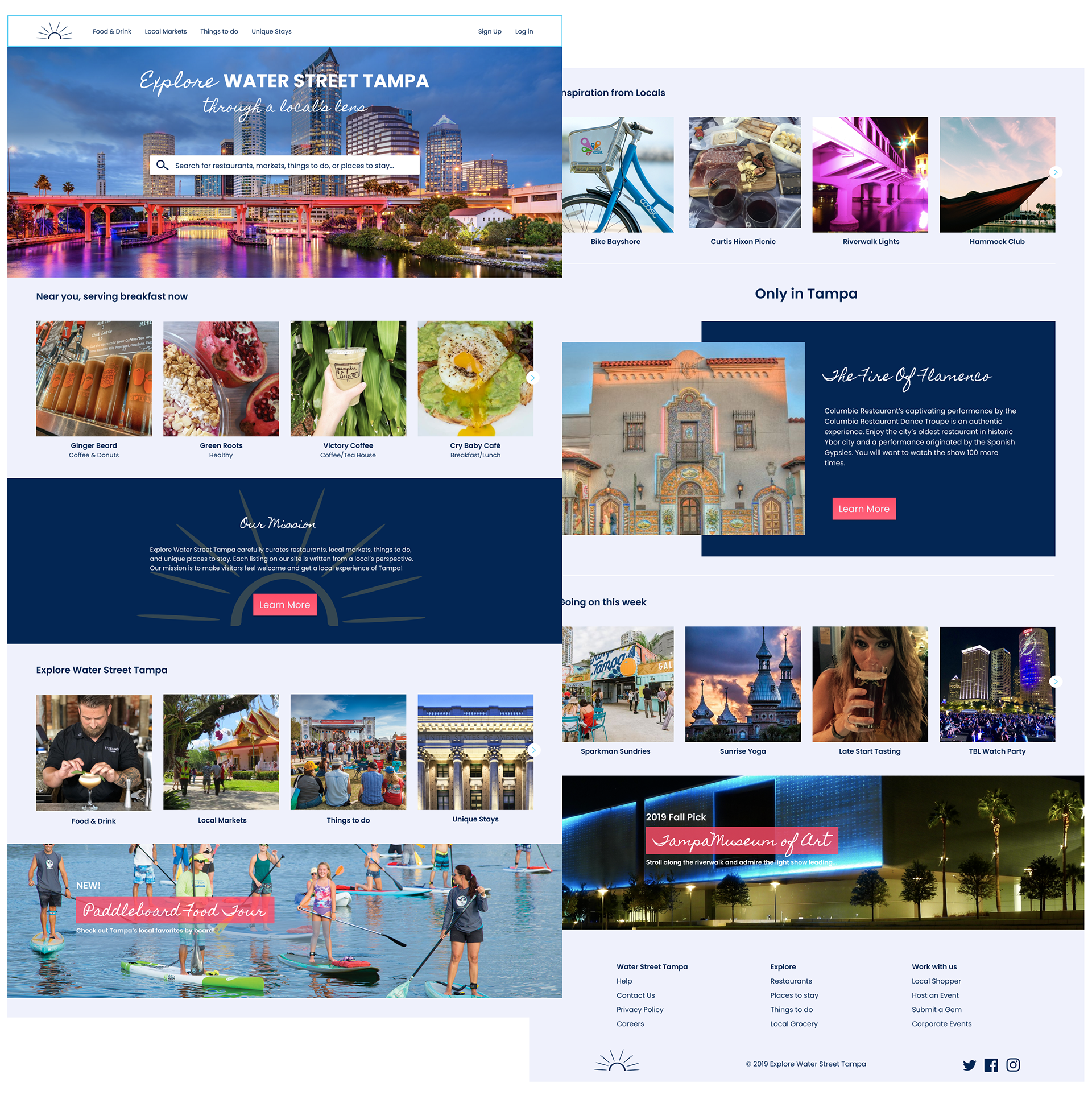
The site needed to be modern and engaging. The chosen videography and photography needed to capture the vibrancy of the area and help show all Water Street Tampa has to offer.

Design Phase
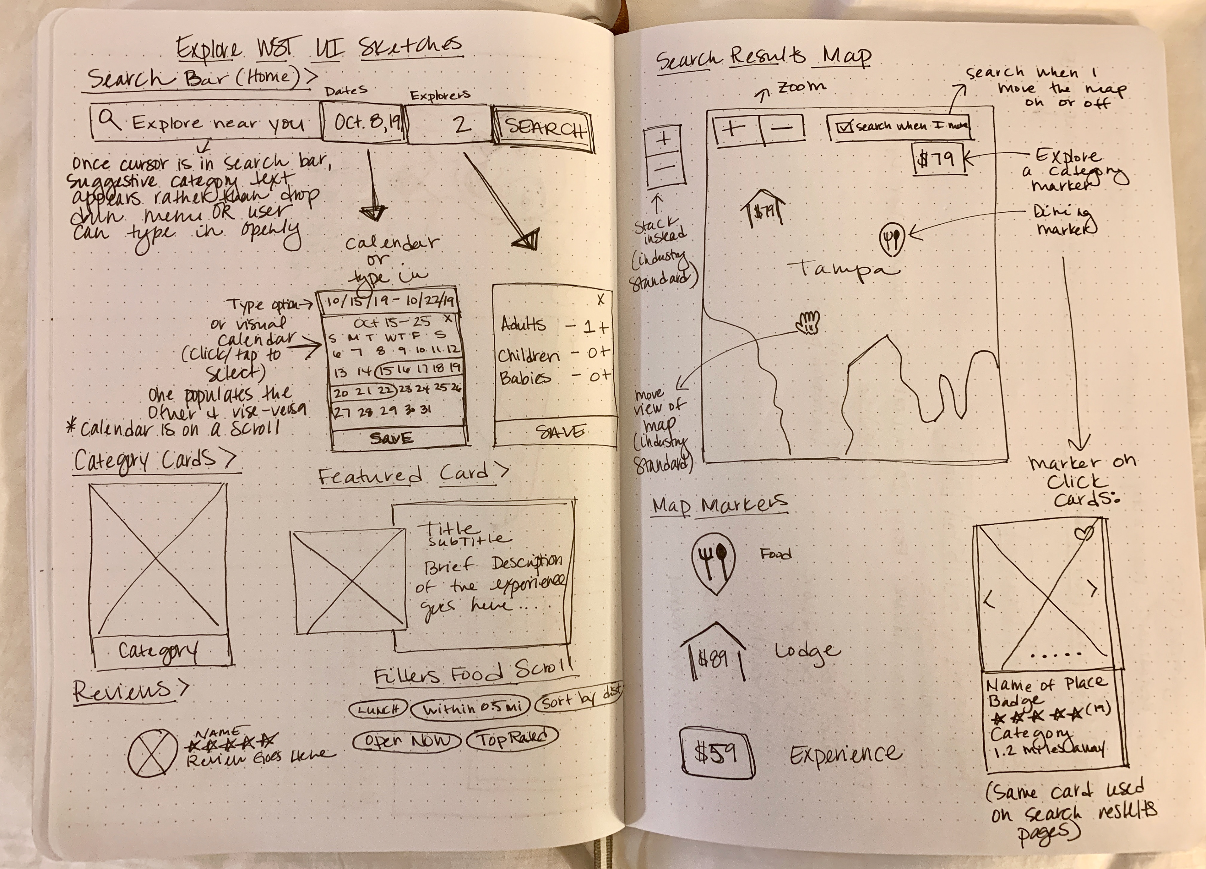
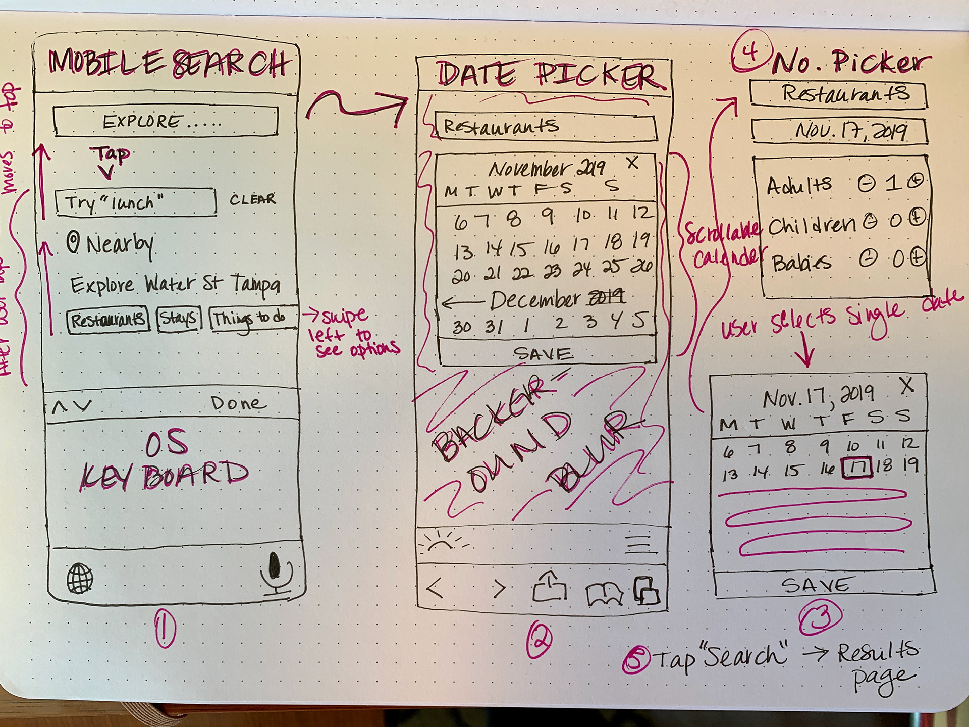
I needed to establish a site map and sketch the user flow in order to start designing wireframes and uncover any gaps. I took pen to paper so I could ideate fast and frequently.
My initial sketches and grayscale wireframes missed the mark. I was spending too much time looking at secondary competition and designing a booking site rather than a site for information.
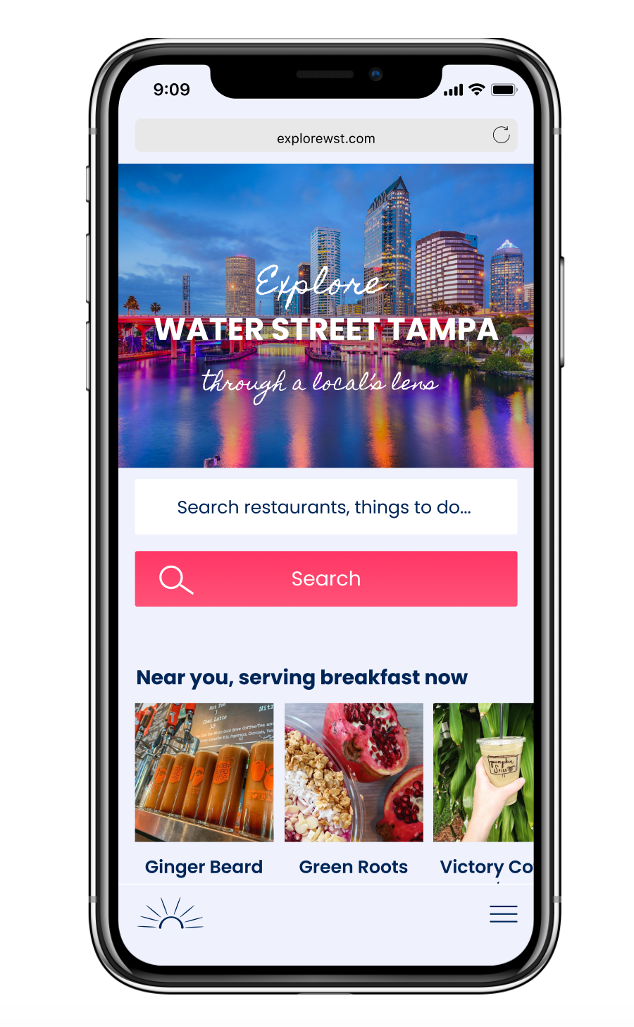
After meeting with stakeholders, I had an “aha” moment. The stakeholders provided specific examples of other sites that were more inline with our goals. Due to a strict timeframe, I only made the changes to the mobile version of the grayscale wireframes. The desktop version is a good sample of what it started out as.
Branding
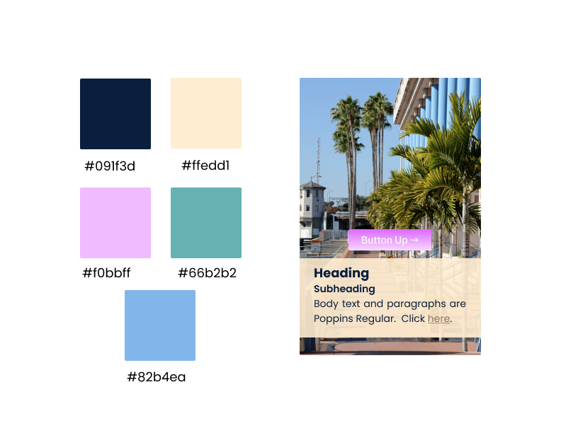
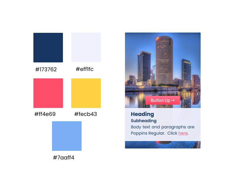
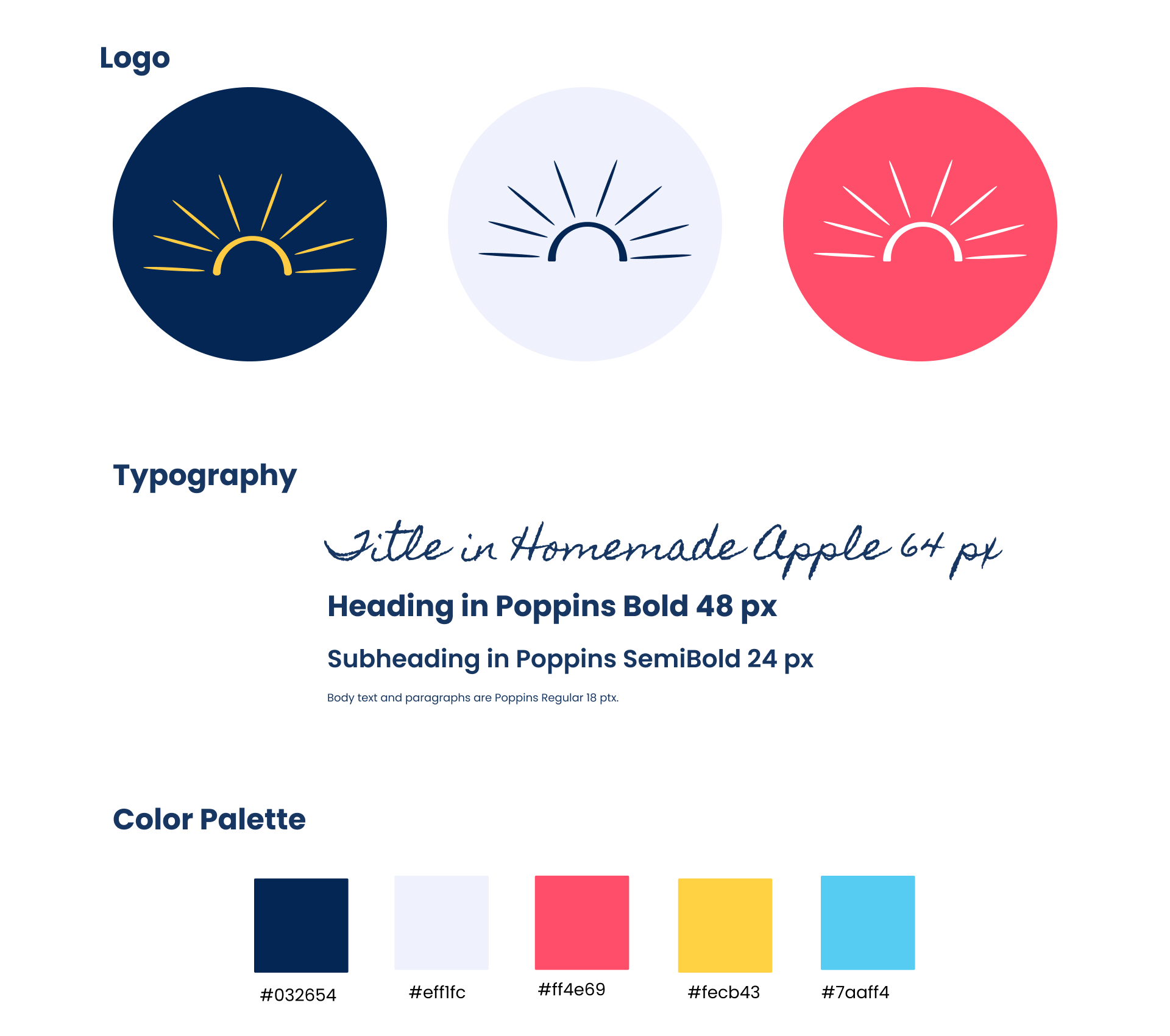
Color selection was a very important process and valued heavily by stakeholders. Water Street Tampa is known for displaying a lot of colors. During the day the sky and water is blue and the foliage is bright green with hints of orange and yellow. At sunset, pinks, purples, yellows, greens and blues paint the sky in a magical way. At night, bright and bold lights along the riverwalk take you to a futuristic universe.
After exploring each significant color palette and discussing with stakeholders, the night option is what I decided to move forward with. It represented the newly revitalized area, while the other palettes were reminiscent of “old Tampa” before it truly came to life.

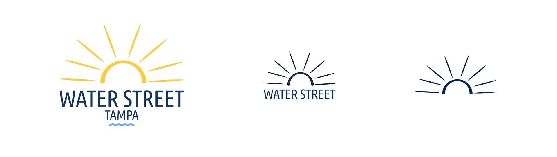
Logo Creation
Since Florida is known as the sunshine state and WST surrounds the river leading to the intracoastal, the initial logo sketches included symbols of sun and water. I also explored incorporating symbols of Palm leaves as the Florida State tree is the Sabal Palm. Visitors often admire and comment on the beauty of the Sabal Palm when visiting the area.
The word “Explore” was never included in the logo variations as the rays of sun symbolized the joy and happiness Explore would bring visitors.
Throughout the design of the initial homepage, the logo was simplified to scale better and focus on just one of the 4 elements to avoid confusion. The tagline “through a local’s lens” naturally offered visual suggestions such as a lens. To avoid looking like competitor TripAdvisor, lens symbols were eliminated as an option.
Typography Selection
The decision to use Poppins for the typography was due to excellent readability and a modern look. Each selection on the site would include a write up from a local expert. I wanted to ensure articles could be easily read.
Homemade Apple, a handwritten cursive font, was added as an accent font to show a level of mature creativity, yet playfulness. The site needed to appeal to professionals with different tastes in foods and experiences, who work hard, but reward themselves too.
There was some discussion surrounding the readability of Homemade Apple; however, I moved forward with the decision as it was mostly younger individuals, who did not learn cursive in school having readability issues. This was not an audience we were necessarily targeting, but something to be aware of and consider developing our own custom cursive typography in the future.
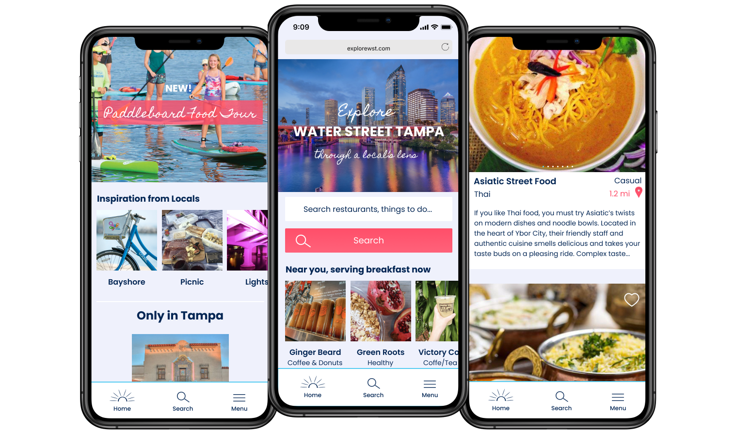
Hi-Fi Prototypes
Put everything together and a hi-fi prototype comes to life for usability testing! Throughout the design process, I continued to revisit competitor sites and sketch with pen and paper to fully flush out ideas. This process was extremely beneficial as I was able to cut the number of clicks in half by zoning in on the true problem I was trying to solve. I was confident the UX/UI was clear and concise, but throughout usability testing with the target demographic, I was able to identify areas of confusion and adjust accordingly.
Usability Testing
Usability Testing revealed needed adjustments. The unique selling proposition wasn’t clear enough on the initial prototype. To solve this, I updated a “Why Explore” marketing pitch to the company’s Mission Statement. I also made the tagline more prominent and increased the text size as users were overlooking “through a local’s lens” and didn’t fully understand the intention of the site.
Suggestive search text was updated to be more descriptive. If a user didn’t scroll down to see the categories, this helped to prompt them more quickly for the types of things they could search for.
The usability testing revealed some confusion around the mobile's navigation being located at the bottom of the page. Users were accustomed to seeing navigation at the top of their mobile browsers. However, due to competitor research and thumb zone research, rather than change the position of the header, I adjusted the design slightly and will continue testing this placement.
Adding text to the icons should help users determine what the symbols mean. The blue line and white background visually separates the menu from the rest of the page more clearly than the white line and matching background did previously.
The "before" and "after" are subtle, but make an impact:
Before Usability Testing
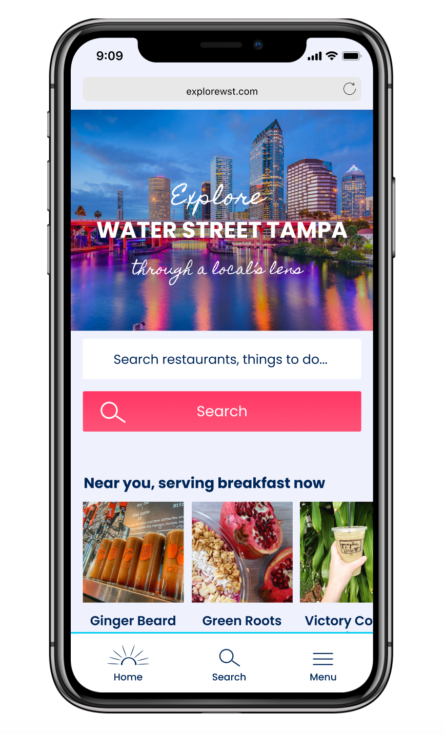
After Usability Testing
Future Plans
Future features to consider include:
· Incorporate 360 tours on description pages
· Test showcasing local experts on the homepage so the purpose of the site is clearer
· Include icons on food photography so recommended dishes are more targeted for visitors (vegan, vegetarian, gluten free, dairy free)
· Add a category for Retail once more shops open (rather than under “things to do”)
· Add a “shared workspace” filter that curates areas that allow customers to set up shop and work
· A/B split test the restaurant description page with "recommended dishes" at the bottom versus at the top (usability testing was inconclusive)
· Include icons in the quick reference box on the restaurant description page
Lessons Learned
In the beginning of this process, I was worried about the site being too different from what users are used to seeing. However, I was looking at sites that solved a different problem than what I was trying to solve. In the future, rather than focusing too heavily on competitor research, I will put more weight on the true purpose of what I am designing for.
Later on, I struggled to stay neutral during the usability testing. After watching the videos and listening to myself, next time I will be aware of my tendency to give away too much information when a user is silent and embrace the silence. I may try experimenting with assistive tools such as Optimal Workshop or Usability Hub to see what type of insights I gain from a different approach.