
This project was based on a speculative creative brief in DesignLab’s UX Academy curriculum. I completed the project over a 2-week duration. I carried out the role of a Product Researcher and Designer. Stakeholders are mentors and industry professionals.
Massage Envy (ME) got its start in 2002 with the aim of making massage services more affordable with a membership-based business model. However, the ME scheduling app currently lacks membership driven features.
Loyal ME members are satisfied they can schedule their own appointments using the app. Members no longer have to deliberate back and forth with an ME associate to schedule an appointment. ME associates receive less phone calls and quickly check-out customers.
ME stakeholders see the value in the investment to create a more dynamic app experience. Loyal members will be pleased and front office staff will have more time to provide face-to-face service and increase up-sells.
Defining the Problem
ME stakeholders recognized areas for improvement:
· Members are frustrated they cannot filter by specific therapists they have built rapport and trust with.
· Sometimes members just need a massage and want to quickly see what’s available.
· Members do not have access to view how many sessions they have in their account. Furthermore, the “amount due” on the appointment details page is not accurate based on membership accounts. It simply shows what the full price of the service is.
· Members would like the freedom to cancel and reschedule using the app rather than having to call.
Below are two videos. On the left is a demo of the app before the re-design. On the right, is a demo of the app after the re-design:
Massage Envy App User Flow Demo: Before the Redesign and New Features
Massage Envy App User Flow Demo: After the Redesign and New Features
Conducting Research
First, I needed to familiarize myself with the massage envy app. I explored the app and it’s functionality prior to meeting with stakeholders. If you are not familiar with their app, please review the brief slide show below to understand how the app currently functions and which features it lacks:
Based on the review and my observations, I was able to have a well-informed and extremely productive conversation with stakeholders in a kick-off meeting. ME wanted to launch as many member-centric features in their next app update as they could. It was important to determine the best way to solve the various problems and develop an achievable timeline:
· Which features will have the biggest impact so we can prioritize?
· What are small wins that are easy to implement?
· Are there bug fixes in areas of the app that are on our improvement list?
Interviews, App Reviews & Competitor Analysis
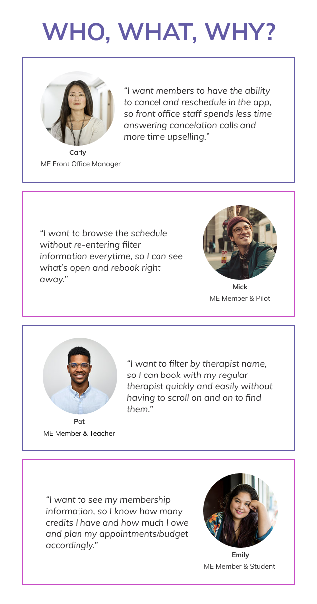
I interviewed different audiences to gain perspective from various angles.
· What was important or worked well in the app for members and front office staff?
· What did members and staff need the app to do that it didn’t?
· How were members interacting with the app?
· Why did nonmembers choose a competitor over ME and how did they schedule their appointments, cancel them, and keep track of their membership?
After several rigorous interviews, I identified who the top users are, what they wanted the app to do and how features impacted ME's business:
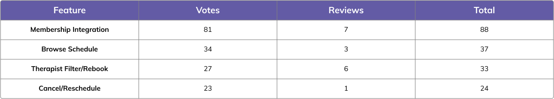
Based on our discussions, as well as a deep dive into the app reviews on GooglePlay and Apple, I was able to prioritize a feature list for the next sprint as well as note future enhancements to consider.
The major trends I was hearing and reading matched our assumptions: membership integration, filter by therapist name or rebook, browse the schedule (60 & 90 minute sessions in the same view), and cancel appointments. I tallied up the votes and reviews to support a feature priority list:
During the interview process, I spoke with a member from a competitor and reviewed the top 5 massage franchises' digital scheduling tool and created a feature benchmark. ME is the number 1 massage franchise in the country and their digital tools should reflect their success. As you can see, ME had some catching up to do:

Technical Considerations
Now that I had a solid feature priority list, backed by research, I needed to regroup with the stakeholders to learn more about any technical considerations or restraints.
To help guide the discussion, I used a visual aid of the current user flow versus a vision for a new streamlined user flow.
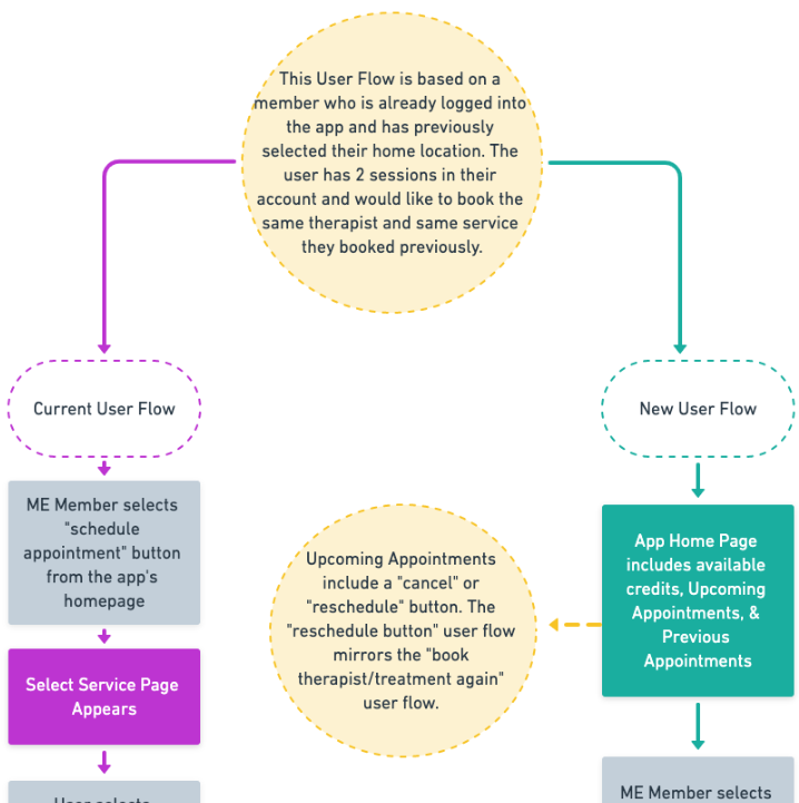
Click to view the full User Flow PDF
Setting Realistic Expectations
The “browse schedule” feature wasn’t going to be achievable for this sprint. Members wanted to browse 60 and 90 minute openings at the same time (rather than having to select one or the other). Members schedule appointments in real-time. Open appointment search results display in equal chunks of time to avoid overlap in scheduling.
The "browse schedule" feature was going to be a big lift, for little reward. Members could still view 60 min and 90 min openings with little effort. I kept this in the back of my mind during the design phase: How could we create a quicker way to view 60 and 90 minute time slots, without running into technical difficulties?
Design Phase
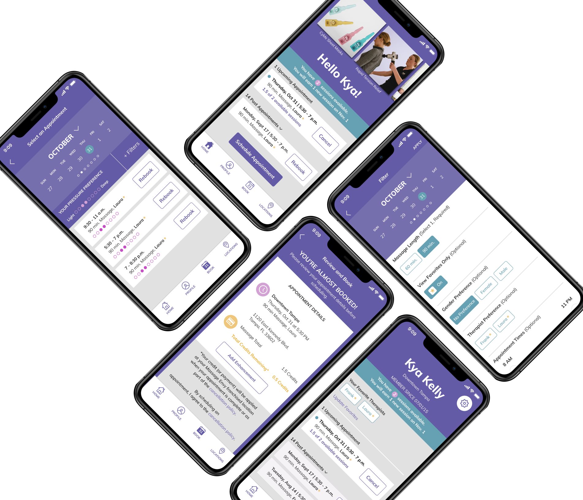
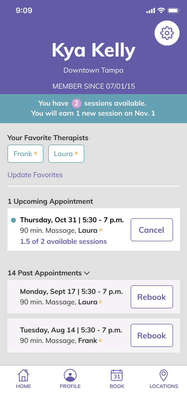
I knew I wanted to incorporate a member-centric dashboard for the homepage. The current homepage was leaning in that direction, but lacked the ability to rebook previous appointments, cancel upcoming appointments, and identify how many sessions the member had available.
The homepage also include a carousel of images that were nice looking, but did not allow users to interact in anyway. If a user saw something they liked in the image, they could not click through to learn more about what the image was showing.
Sketching & Low Fidelity Wireframes
I started with a few brief sketches then created low-fidelity wireframes to see what the stakeholders thought about a new layout for the home screen. We also discussed the cancelation and rebook features with the development team for feasibility. The new screen below (left), features a scrollable photo section for marketing purposes, sessions available, ability to cancel upcoming sessions, and the ability to rebook previous sessions versus the current home screen (right).
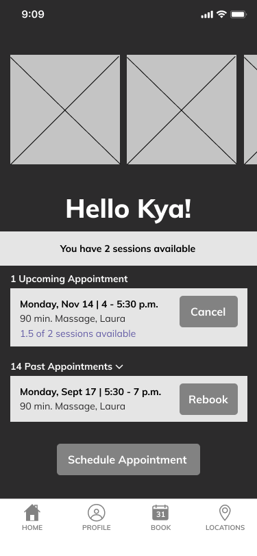
Proposed Design
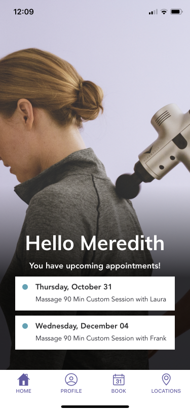
Current Design
Stakeholders agreed the dashboard home screen was great for members, but also gave the marketing team an opportunity to educate members about add-ons and showcase specials. Members would no longer have to scroll through 2 pages of add-ons every single time they booked an appointment and ME gained a new promotional space.
The low-fidelity wireframe allowed the team to visualize actions a user needed to take to cancel an appointment, rebook a previous appointment, and schedule a new appointment.
There were several improvements incorporated into the first version of the high-fidelity wireframes based on identified gaps using the low-fidelity version. First and foremost, the ordering of the flow was updated to be more logical rather than the order of which the features were designed for a more natural usability test.
Usability Testing
Testers were given a link to the prototype and tasks to complete. Try it out with the final version of the prototype and task list below:
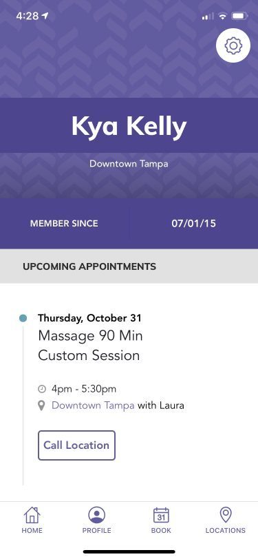
1. From the homepage of the app, rebook a 90 min massage with Laura for Thurs. Oct 31 from 5:30 - 7 p.m.
2. You have no changes to you Massage Preferences and you do not wish to add any enhancements to your appointment.
3. Hit “Done”
4. You just realized you have a conflict and need to cancel the appointment you just booked.
5. You decide to Schedule a New Appointment.
6. For purposes of the prototype, schedule the same appointment: Massage, 90 min, Laura, Thurs. Oct. 31 from 5:30 - 7 p.m.
7. If you wanted to update your favorites where would you go?
Testers moved through tasks without any issues and commented the app was intuitive. However, while observing testers, I noticed slight hesitation occurred on the filter page under "gender preference". Users thought they had to use this filter in order to find Laura. Therefore, I continued to evolve and test the page several times. The goal was to condense the various pages users had to go through to schedule an appointment down to 1 or 2 pages, but also give them the ability to filter by therapist.
The image sequence below (from left to right) shows the initial filter page and how it evolved to the final version to include a favorites toggle so users can quickly find the therapist they want. I adjusted the order of options for "gender preference" so "no preference" is listed first and auto-selected. This small change helped users move through the page faster:
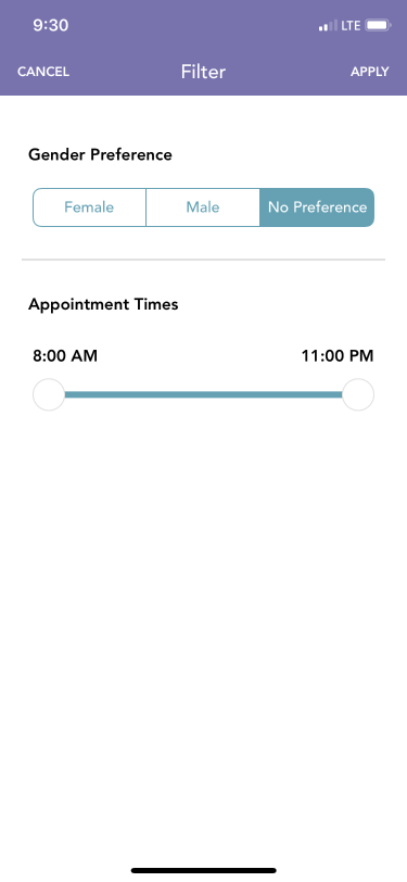
Original Filter Page

Version 1
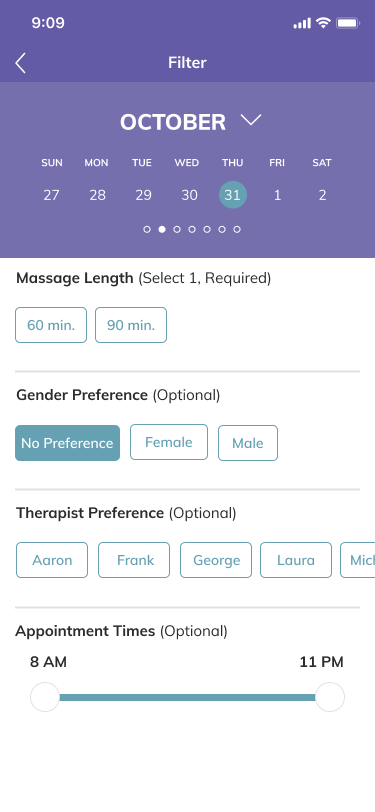
Version 2
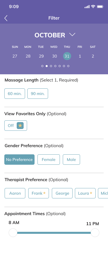
Final Version: Default View
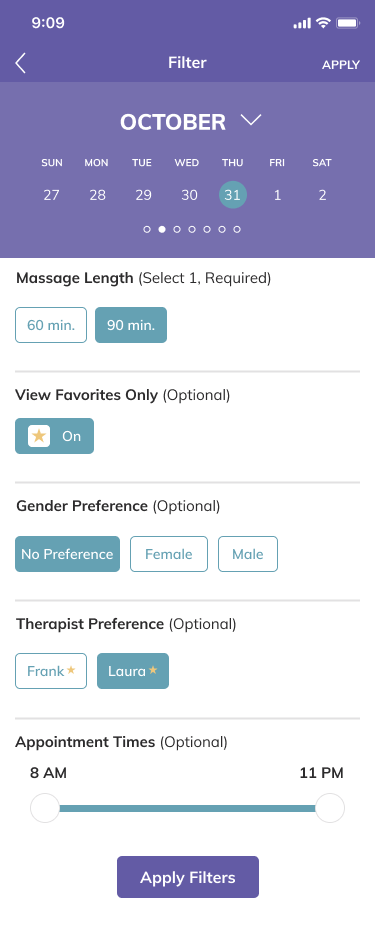
Final Version: Selections Made
Below is a before and after of the Profile section of the app. The new version gives members the information they were calling in to receive and now they can access it on their profile page and make adjustments to their favorites, email, password, credit card on file, rebook, and cancel appointments.
Before
After
Future Plans
Other areas Identified throughout this project to improve in the future include:
· The ability to browse both 60 and 90 minute sessions at the same time.
· Continue to A/B test the enhancement placement on the home page (above the name and below the name) to see which performs better.
· Include therapist biographies and photos. Some members commented they don't always remember names but tend to remember faces and this would help them schedule with therapists they liked in the past.
Lessons Learned
I considered using Maze to conduct usability testing to cast a wider net. After researching the product, I decided to stick to doing testing in person. I gain more valuable information through observation.
The users I observed all commented the app was very intuitive and they had no problems moving through it. Each time they had hesitation they blamed themselves, but in actuality, it was a design flaw causing their hesitation. If I had used Maze, my results would have been different and I would not have been able to identify where their hesitations were. I would like to test this theory in the future to see if results vary.