
This project was based on a speculative creative brief in DesignLab’s UX Academy curriculum. I completed the project over a 2-week duration. I carried out the role of a Product Designer. Stakeholders are mentors and industry professionals.
The Optimizer app was designed to help doctors, medical staff, and patients involved in addressing hormone imbalances. Companies such as Biote® Medical and Life Extensions® specialize in alleviating patients’ symptoms due to hormone imbalances.
Medical Doctors all over the country become Certified Biote® Providers. Providers monitor patients’ progress with blood tests. Patients are often on a regime involving supplements, compound prescriptions, bioidentical hormone replacement therapy, and other lifestyle changes. The process can be tedious and expensive, but rewarding. Insurance generally does not cover treatment plans or doctor’s visits.
Despite patients reporting excellent results, many quit due to the cost, frequent doctor’s visits, and confusion about the process. Patients do not have a reliable technical product to turn to and patient portals often create bad user experiences.

The Optimizer app is designed specifically for hormone balancing so patients can understand the process, budget for treatment, and stay on track with appointments and regimes. This project focuses on the front end of the product, geared towards patient use.
Research
The first step in my process was to get a better understanding of my audience, the issues they were having and how an app could help them. I conducted research by interviewing certified providers, staff, and several patients. Staff ranged from medical doctors to front office admins. Patients varied in age, sex, and customer journey. Staff was concerned with streamlining information and retaining clients. New patients tended to be confused about the process and budgeting, while longer term patients were more interested in keeping track of their lab results to see progress overtime.
None of the patients found the current patient portal to be useful. Lab results were uploaded in PDF style, making it hard to track progress. Supplements, medications, and follow up lab tests were provided on paper for the patient to take home and track. Paper receipts were given to the patient, making it difficult to determine how much treatment could cost throughout the year. Patients wanted to take an active role in optimizing their health but felt overwhelmed and unorganized.
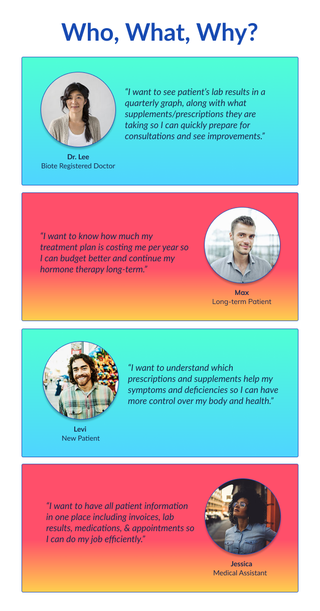
The staff felt the patient portal could be easier to use and help aid them in appointment reminders, as well as supplement and medication tracking. Ideally, lab results would integrate directly from LapCorp, rather than scanning and uploading them. Doctors would like to have a visual aid during their patient consultations to help drive the discussions and allow patients to understand their progress. Security and patient privacy were top of mind— ensuring a secure profile would be a high priority.

Throughout this process, I was investigating the patient portals myself as well as other apps on the app store. It seemed one of the major problems was most products were designed for the staff without the patient in mind or some products were solely designed for patients to enter their own information manually. The goal for Optimizer was to consider the medical staff and the patient to streamline regimes and communication.
Based on the research I developed a “must have” feature list for the product launch and a timeline.
Sketches & Wireframes
Since I was creating this product from scratch, I started my design process by sketching ideas on paper for speed and ease. After spending time exploring patterns and information architecture in like products, I had some ideas on how to solve some of the problems discovered during my research phase. This helped prepare ideas for wireframes and allowed me to explore many different ideas.
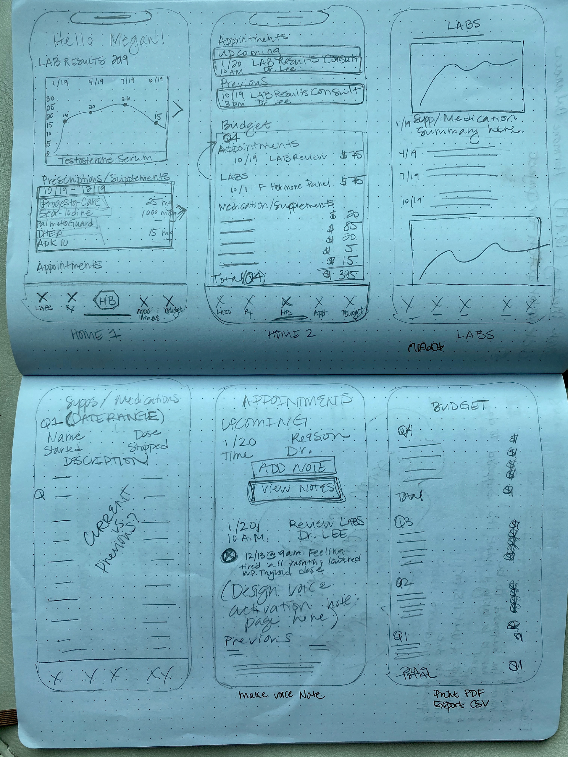
I created a framework wireframe for the main pages of the app to get an idea of what information needed to be included and patterns to display that users would find intuitive and familiar. During this process, I realized many of the health apps I reviewed did not include a budgeting feature, so I researched several banking and credit card apps.
Developing a Brand
Patients balancing their hormones are generally progressive thinkers who take an active role in their health. They are typically over 40 (although some are in their 30’s) and paying out-of-pocket for their treatment. Progressive, active, and vibrant is what I wanted the Optimizer brand to portray.
I presented the following options to stakeholders and decided on the first option on the left, bottom row of icons. Initially, the app name was going to be “H-Balancer” but after further research, I decided to go with “Optimizer” since certified providers often use the term “optimize” rather than balance.
App Icon Options Presented to Stakeholders
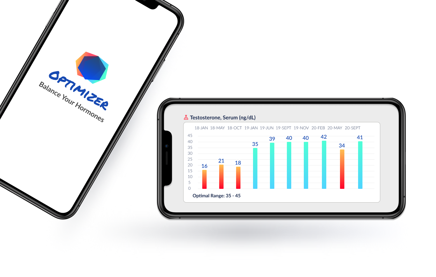
Lab Results
It was very important the graphs displaying patient’s lab results included all pertinent information while being simple enough to understand. Patients early in their customer journey only want to see the most recent lab results, while later on in their journey they want to see the history and progress:
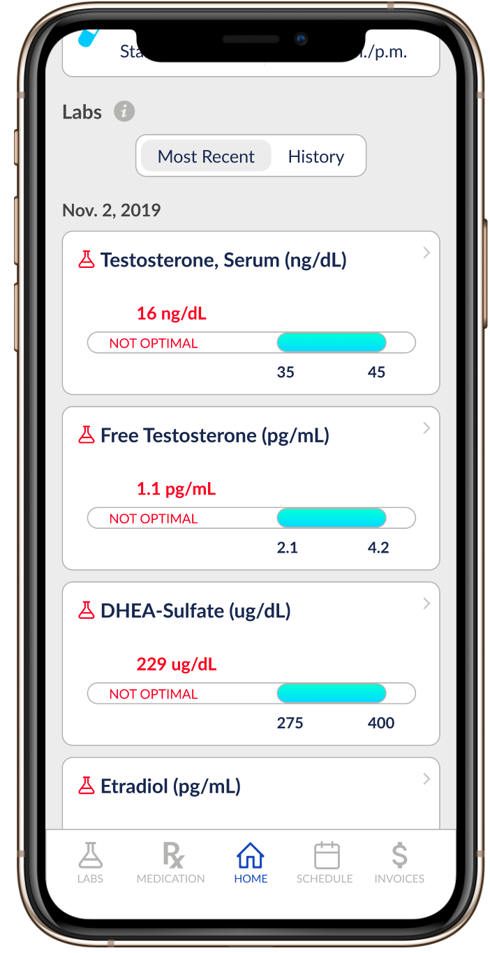
Most Recent Lab Results View
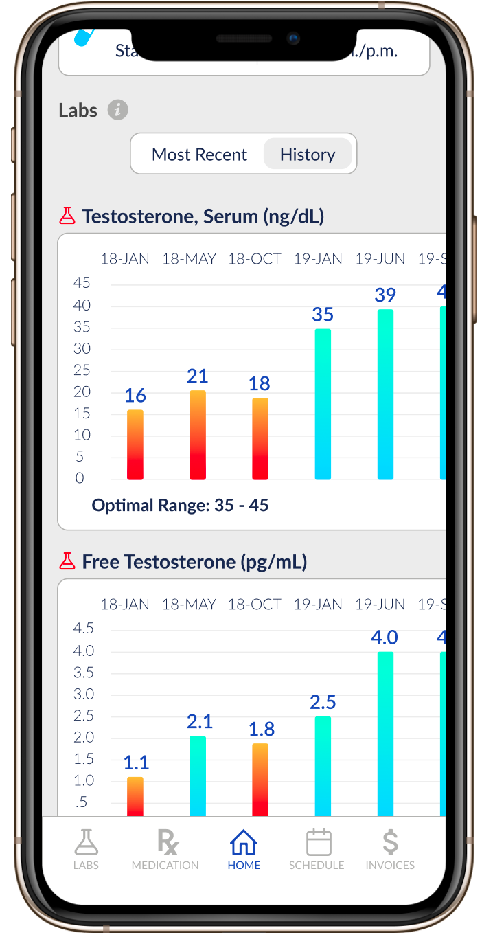
Historical Lab Results View
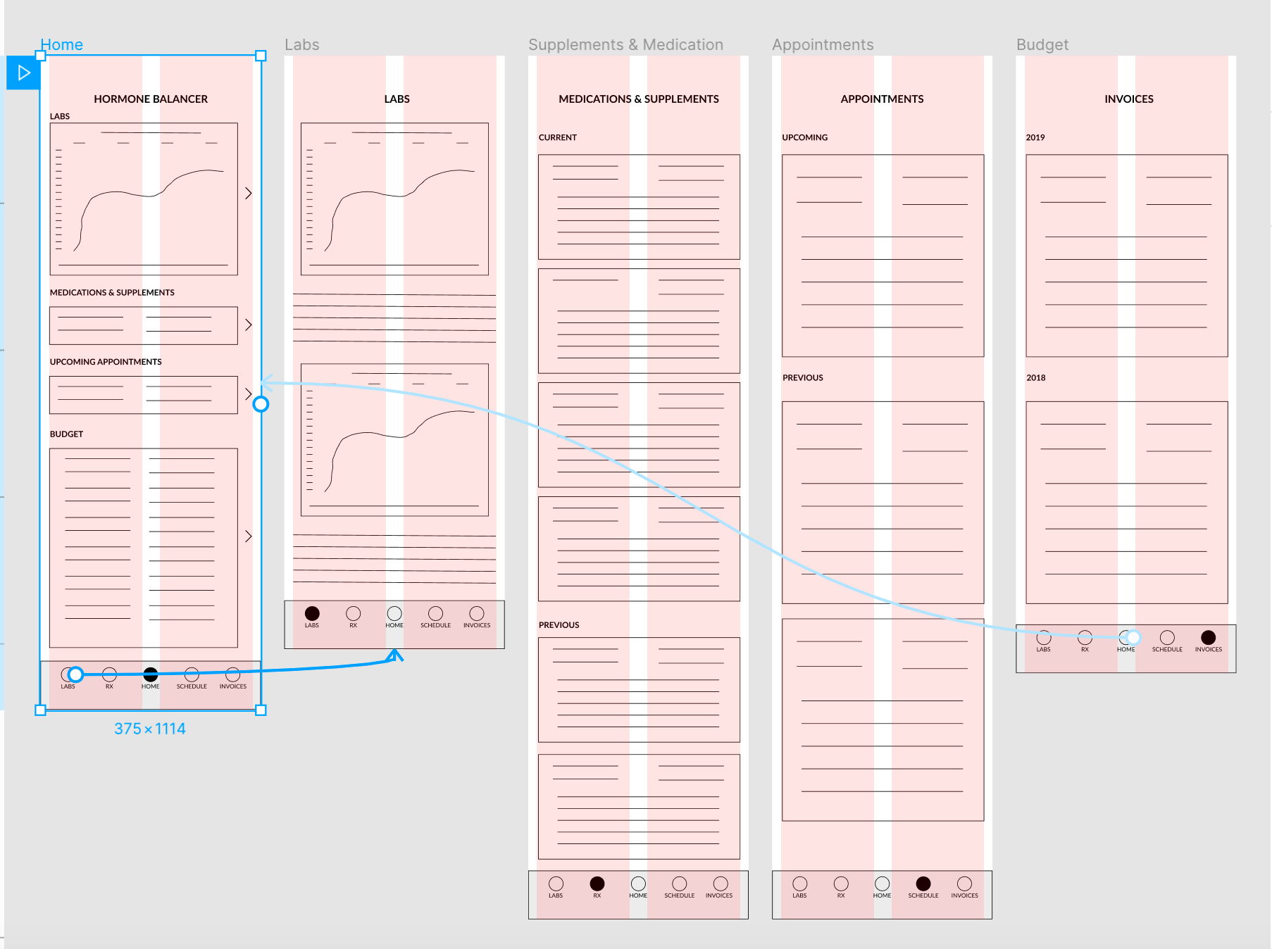
High Fidelity Prototype
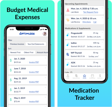
My goal while creating the high fidelity prototype was to include all of the information interviewees and competitor research deemed important in an intuitive format. The top features included appointments, medication tracker, lab results, and budgeting.
Marketing on the App Store
Patient portals often have limited functionality and patients rarely adopt them, as they generally aren’t user friendly or beneficial. Patients can monitor their health on their own with their smart watch or device and will expect the same experience when they are paying a premium to balance their hormones.
Marketing on the app store needed to portray a futuristic patient portal and not just another one they will never log into. The vibrant colors help reflect when a patient is in the optimized zone paired with the shape of hexagons symbolizing harmony and balance through science.
Next Steps
Features to add in the next app update include:
1. Messaging/Chat feature
2. Summary for labs that includes which portion of the regime had a positive or negative impact on the results
3. Previous Appointment doctor’s notes
4. Patient Diary
5. Supplement Ordering/Inventory
While this project focused on the patient user interface of the app, the back end design for medical staff will be equally as important. In order for patients to benefit from the product, the hormone optimizing medical community must adopt the product. Or providers could keep their current patient portals and feed the app data through API’s.
Usability testing will continue to help shape updates made to the Optimizer app. The first testing phase helped reveal the need to incorporate most recent lab results versus a historical view.
Lessons Learned
Most patient portals have been designed with the medical staff in mind. Patients often take a passive role when it comes to health issues and simply want a doctor to make them feel better. Society is starting to see a shift in this mentality and patients will seek providers offering good technology to streamline processes.
The Optimizer has the potential to offer patients a better solution and make their journey to a healthy lifestyle easier.